Wednesday, 22 February 2012

Wednesday, 15 February 2012
Audience Feedback
Recently, we completed drafts of our texts and we decided to e-mail these to some audiences as a way of identifying how effective the texts are, whether they have the desired effect on our audiences and where we need to improve.
Judging from the responses that we got, it seems that on the whole, the audiences were impressed with the results. One of the most common positives was that they felt that the trailer did a good job of not giving too much of the plot away and the enigma generated curiosity and intrigue. They also liked the layout, colours and fonts included in the magazine front cover and the poster as they thought that these clearly indicated the genre of the texts.
However, one of the negatives that they found was that the music was not as conventionally Western as they would have expected from a Western trailer and that it did not quite match the feel of the trailer. They also identified that they would like more information on the movie and the actors included in the trailer as we had only included information about the release date and the past works of the directors with just the one line - 'Who do you trust?' - in relation to the content of the movie in order to keep the trailer as enigmatic as possible.
So, we have responded to the constructive criticism of our audiences by including more text in the trailer with information on the cast and the directors as the audiences wanted and we are currently working on creating a new soundtrack! :)
Wednesday, 1 February 2012
Poster: Final Images
Here are our selection of the final images to be included in the poster:


However, in the end the effect that I felt best achieved what we wanted was 'Poster Edges' ... So, here are the final images that will be used in the poster:


'EAGLE'

'LORETTA'

'SHERIFF'
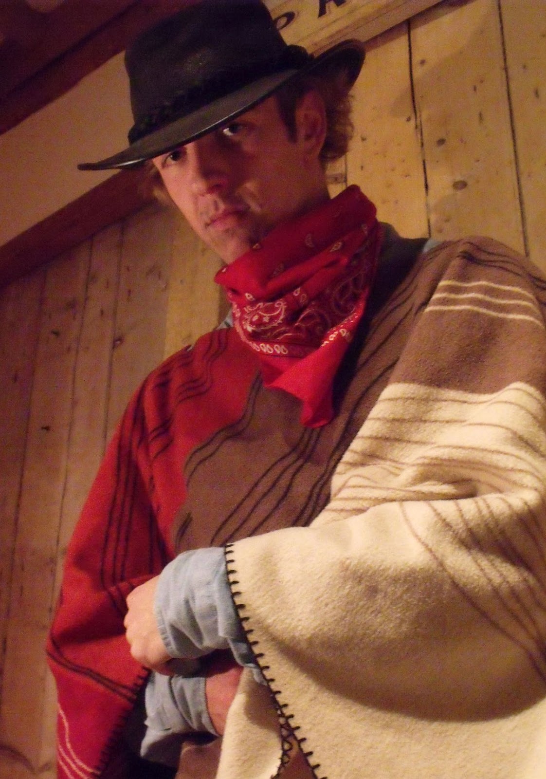
First of all, we decided on this image for 'Eagle' as we wanted an image that slightly concealed his face with shadows. We wanted this as, usually, across all texts - not just Western films - the hero is often shown in brighter light than the villain as light is often associated with good and the dark with bad/evil but we wanted to challenge this. We wanted to portray to the audiences the fact that he is an unconventional hero as within the storyline of the film, he is an outsider, yet, he manages to 'save the day' - conventionally, in Western movies, the 'outsider' is often the 'bad guy'.
Likewise, you can see in the 'Sheriff''s image that we have used a lot brighter lighting as he is the 'Sheriff' - a job that supposedly means that he is of good character and is capable of protecting the settlement. However, we have also created a dark shadow behind him in order to depict that he has a part of him that is hidden and dark. Also, in the image you can see that the sheriff has his hand on his gun - a show of power - and has an arrogant expression on his face as he is looking down his nose at the audience. These all hint to the audience that the Sheriff could be taking advantage of his power. Therefore, we chose this image of the Sheriff to go onto the poster.
Going back to the chosen image for 'Eagle', we have chosen to make use of an extremely low angle in order to show that he may be an unconventional hero - achieved by the use of lighting techniques - he is a hero, nonetheless. Low angles often force the audience to treat the subject with higher regard and respect. Also, we chose to have 'Eagle's arms crossed with a serious expression and against a simple background in order to portray his personality to the audience - closed off, serious and mysterious.
In 'Loretta's case, we chose to have her in the bar as her job as a bar maid predominantly the reason why she ends up in danger in the film (she overhears the Sheriff's less-than-respectable plans and the Sheriff threatens her to keep her mouth shut), so, the bar is a very important location for her. Also, she is looking into the camera with a soft gaze - letting the audience know that this character is the 'damsel' that is so often present in Western films and also in most other texts, according to Propp's theory. We also chose to have her in natural lighting as we felt that this depicted her ...
We had previously decided from our poster analysis that a lot of posters for Western films seems to have illustrated or painted effects ... So, now that we have chosen the images to be used in the poster, it's time to experiment around on Adobe Photoshop to see how we, too, can achieve the illustrated effect that was evident in so many Western posters.
Here are some of my experimentations:

The 'Film Grain' effect ...

The 'Palette Knife' effect ...

The 'Paint Daubs' effects ...


Subscribe to:
Comments (Atom)